
Errands To-Do List App Redesign
Tabletop is a tablet application for developing and playtesting card and board games. The old design was not that strong; it relied heavily on iOS system UI and graphics that looked suspiciously like clip art. In a world where a search for "To-do List" on the app store turns up well over 100 results, you need to have an app that stands out.
While Errands is one of the highest-rated to-do list apps, reading its reviews you learn that it's only because of it's features, not it's interface or looks. Some users admit to putting up with crumby graphics and counterintuitive interface just because the app offers features that none of the other free apps do, like the ability to recycle tasks. I spent a lot of time looking over the reviews of Errands, as well as the reviews for similar apps to get an idea of what people really wanted from a to-do list.
Personas
By looking at the reviews, advertisements, and some plain-old sleuthing, I identified the target audience of the run-of-the-mill to-do list app as the young professional woman. The sweet spot age seemed to be mid-to-late-twenties; old enough to have responsibilites, but young enough to be attached to her phone at the hip. I also tagged myself in as a potential user, since I could see myself using a to-do list app to keep organized.
Knowing the user is important for any app, but especially for an app like a to-do list that is meant to be used daily for a short time. Errands is a tool, it's not something that the users are expected to spend hours on browsing. I looked to Facebook and Twitter for UI inspiration, since our target audience is already familiar with these apps. Errands didn't need to challenge users, it had to be something as familiar to them as the traditional pen-and-paper to-do list.
Paper Prototyping
This was actually my first time running a paper prototype, and I realize that there's a lot of room for improvement here. In preparation, I mocked up every screen I could concieve of the user finding, leaving me with a stack of forty or so screens to sort through every time a button was pressed. Now that I've learned quite a bit about prototyping, there's a lot I would go back and change about this, especially the way that I interact with the user. But watching the user (my friend Reid) interact with unfamiliar icons and unclear layouts taught me a lot about how people would be approaching the app, and highlighted what areas I really needed to focus on.
UI Mockups
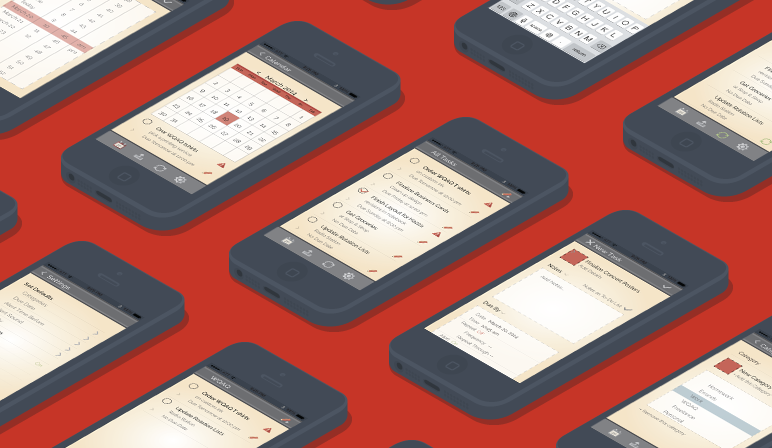
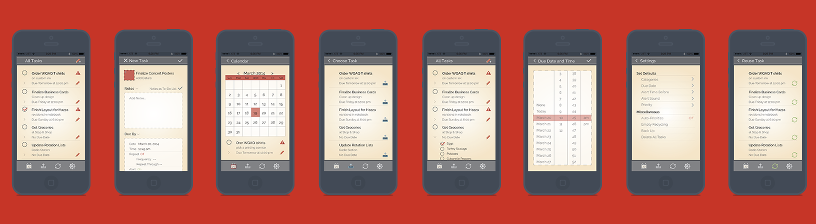
The redesign of the app went well. I tried to give it a bit of a unique graphic style; not quite flat, but not too detailed as to take away from the important information. I also avoided the lined paper look, since that's a very clichéd look for apps that parallel a real world item - in this case a loose leaf to-do list (although it did go through a phase where it had it).
I fixed a lot of the UI issues that I learned about from my paper prototyping. I improved the icons and gave them color accents to tie icons to their pages. I made the menu structure more intuitive by combining elements on to longer pages rather than having multiple subpages. I'm very proud of the way that this app redesign came out, especially since it was my first foray into the world of UX/UI design.