
Pericles Project Website
The Pericles Project is (a theoretical) non-profit organization that encourages young adults in CT to volunteer with organizations by giving them credit toward theather and orchestral performances. They wanted a website redesign, using the logo and elements provided (incomplete) by a previous designer.
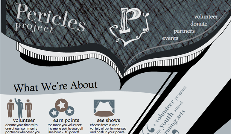
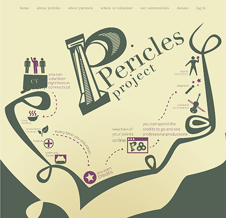
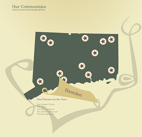
They site also needed to have an infograpgic on its homepage to help their target audience, young adults, better understand how the organization works, as well as how it can benefit them. THe visuals needed to appeal to young adults without looking "kiddish."

Information Architecture
This site didn't need to be overly complex. The bulk of it is dynamic pages: dynamic pages for users and shows; as a matter of fact there were only two real real static pages.
You might notice that the original IA had pages for users to have a personal page. Within the time constraints of the class project, the idea had to be, unfortunately, shelved.

Comps
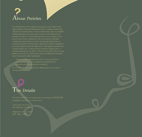
At first, the site was going to be a horizantal scroller, since there's so much you can do visually in a large horizantal space. The comps had a very light feel to it; very little was straight, save for the body text of the about section and navigation. The goal was to make it seem fun and not to serious, rather than as if it were askew.
I chose green, since it was a prevalent color among other charitable work organizations. The beige was a lightened and desaturated version of the direct complement of the green. The accent color started out as a placeholder, something different enough that I could pick it out as I worked, but ended up working well.
Website
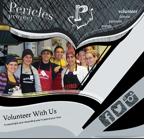
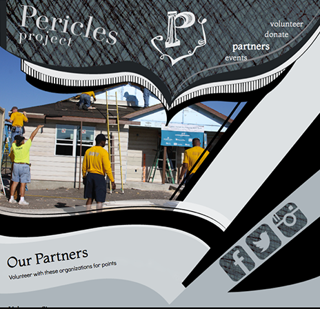
The final product looks very different than the first round of comps. I dropped the horizantal scrolling site for a paginated one after I bulked up the header to emphasize the fun, funky shapes that the "previous graphic artist" left behind. The large and interesting graphic elements make this site stand out a little more than your average charity site.
The colors became a little more muted and focused into a color scheme. I also cleaned up the issues I had with strange angles on the comps; the tilted elements aren't as violent and are used as graphic elements. I also beefed up the social media icons to engage and connect with the target audience of teens and young adults.