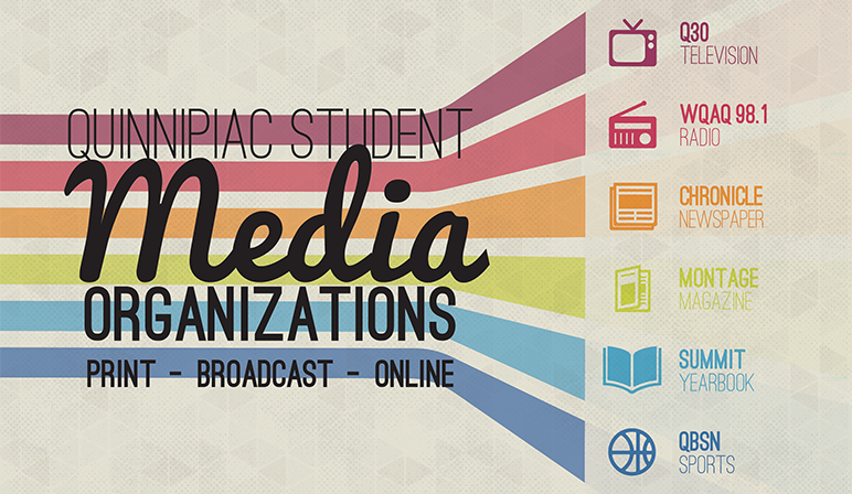
Quinnipiac Student Media Branding
Quinnipiac Student Media (or QSM, for short) is the umbrella group of Quinnipiac's six main media organizations: Q30 Television, WQAQ Radio, The Chronicle Newspaper, Montage Magazine, The Summit Yearbook, and The Quinnipiac Bobcat Sports Network.
The goal of this project was to create a strong and recognizable visual identity for Quinnipiac Student Media. With six different groups, each sporting their own logo and identity, the earlier materials for QSM were very eclectic and overly complicated. I wanted to give QSM a look seperate from each of the component groups. I started out with the imagery of a prism, and eventually developed the concept into the final product.
Early on in the project, I realized that connecting each of the groups with a color and an icon would be the key to the branding. That way across all of the material there would be an easy way to identify information relevant to a specific group.
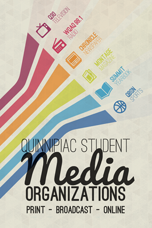
Info Card
The best way to reach out to students looking to join an organization is at the school's annual involvement fair, where clueless Freshmen wander the Quad, going from table to table trying to find a club to join. Students get tons of literature over the course of the fair, so it was important to make sure that QSM's cards would stand out. The combination of a the card's bright colors and a thicker stock went a long way to making sure students wouldn't just toss these cards like the dozens of other flyers they'd get that day.
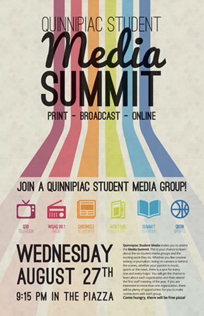
Media Summit Poster
In my time working with the WQAQ 98.1 FM radio station, I've learned that a big, splashy poster really draws people to your events. In this case, the event to draw people to with the big splashy poster was the annual Meida Summit, where all the media groups come together to meet with new students and talk about the work they each do.
This is where QSM's branding begins to shine; students who just recieved an infocard earlier that day would recognize the branding of the poster and pay attention to it. That strong visual connection helps keep interested students aware that this poster is for them. Also, it doesn't hurt that the poster is bright and eye-catching enough to draw in students who didn't pick up a card. That, and it says those magical words at the bottom: "Free Pizza."
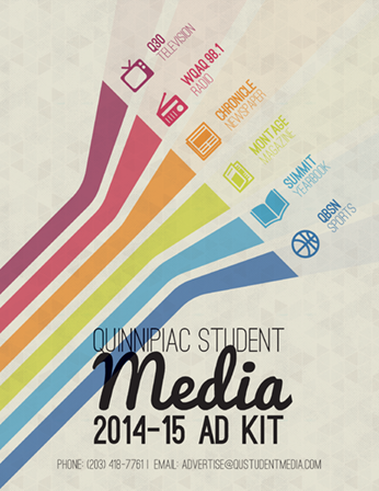
Ad Kit
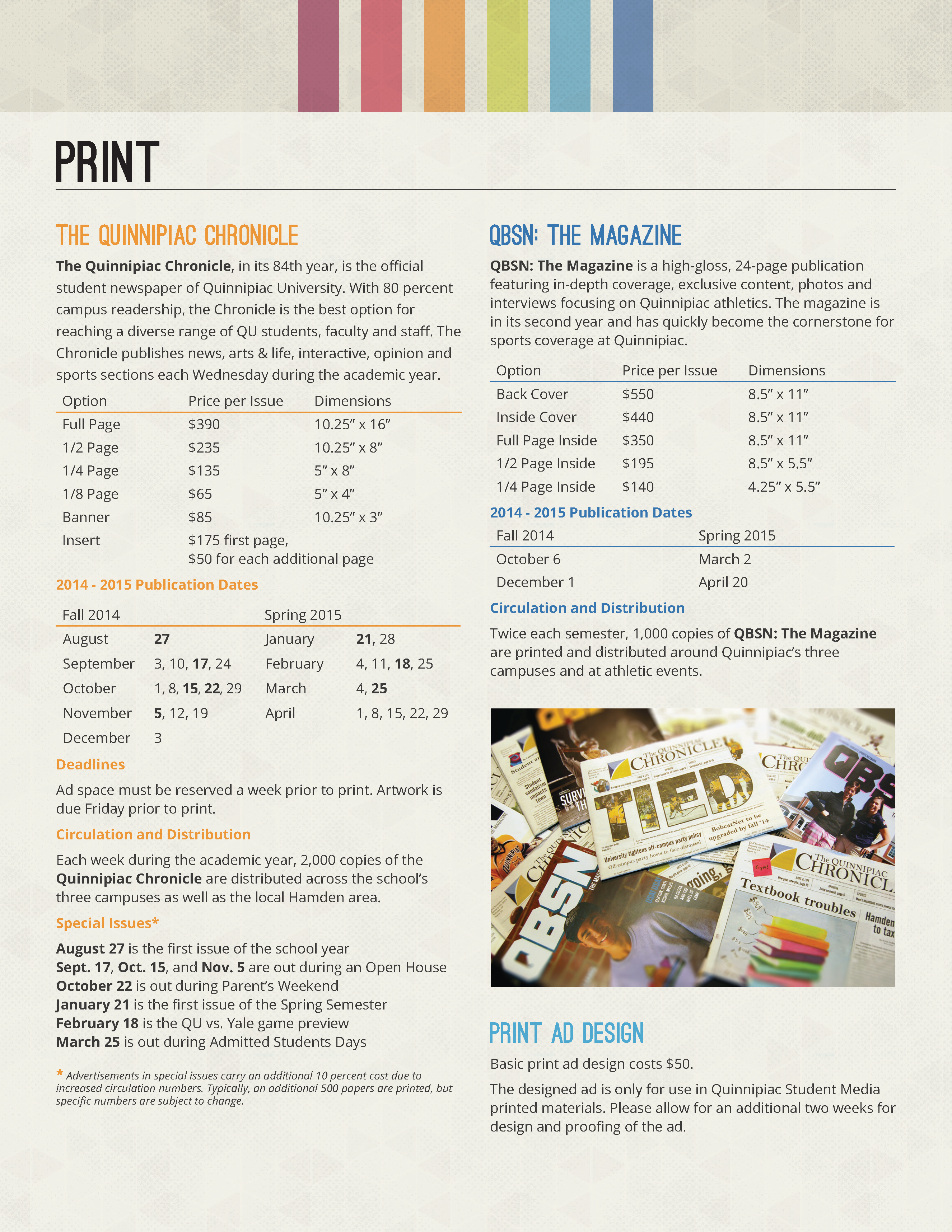
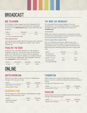
The main challenge of the ad kit was effectively presenting all of the different pricing and information without letting it get to cluttered. I decided to block the information into media rather than organization, since advertisers would be more interested in in the medium rather than the specific organization. I also used the organization's color to identify it's descriptions and pricing charts across the entire ad kit.
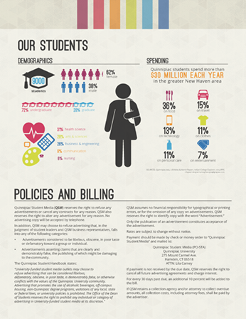
I had a lot of fun with the infographic on the back. In the initial sketches, it took up the whole back page, with information on student lifestyles, spending and media consumption, as well as blurbs about each of the three Quinnipiac campuses. Of course, not all of that information was readily availiable, so I had to do some polling and research on my own. In the end, I was left with the information currently in the infographic.